If you’ve ever approved a design on screen and then felt disappointed after printing it, you’re not alone. One of the most common issues in printing services is the difference between what you see digitally and what you get in print.
This difference often comes down to color systems—specifically CMYK and RGB. Businesses working with custom printing services in Los Angeles frequently face this issue when files are not prepared correctly for print.
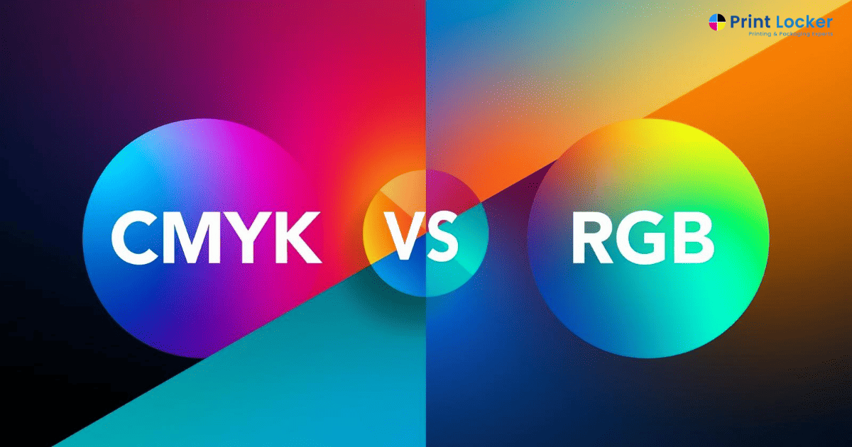
🎯 The Core Difference Between CMYK and RGB
RGB (Red, Green, Blue) is used for digital screens.
CMYK (Cyan, Magenta, Yellow, Black) is used for printing.
👉 Screens emit light
👉 Printers use ink
Because of this fundamental difference, colors that look bright and vibrant on screen may appear slightly dull or different when printed.
🧠 Why Your Print Looks Different
The problem is not the printer—it’s the color conversion.
When RGB files are sent for printing:
- Colors are automatically converted to CMYK
- Bright tones may lose intensity
- Contrast may change
This is especially noticeable in products like business card printing same day, where color precision plays a big role in brand presentation.
📉 Where Most Printing Projects Go Wrong
Most issues happen during file preparation:
- Designing in RGB instead of CMYK
- Using colors that don’t translate well in print
- Not checking print previews
Even when using fast services like same day poster printing, incorrect file setup can lead to unexpected results.
🖨️ How CMYK Impacts Different Print Products
Different print products react differently to color conversion:
✔ Business Cards
Require accurate brand colors and clean contrast
✔ Banners
Need bold colors for visibility from distance
✔ Flyers
Balance between readability and visual appeal
✔ Packaging
Consistency across batches is critical
This is why businesses searching for printing services near me in CA often prioritize providers who understand color accuracy.
📍 The Role of Material and Finish
Color is not the only factor—material also affects output.
- Matte finish → softer tones
- Glossy finish → more vibrant reflection
- Textured paper → absorbs ink differently
This is where choosing the right custom printing company in Los Angeles becomes important, as they can guide both color and material decisions.
⚡ How to Avoid Color Mismatch in Printing
To get better results:
✔ Design in CMYK from the Start
Avoid automatic conversion
✔ Use High-Resolution Files
Low quality affects color clarity
✔ Request a Print Sample
Check before bulk production
✔ Avoid Overly Bright RGB Colors
They rarely translate well in print
📊 Why This Matters in the USA Market
In the USA, brand consistency is critical.
If your printed materials don’t match your digital branding:
👉 It affects trust
👉 It reduces professionalism
👉 It creates inconsistency across campaigns
This is why businesses now focus on professional printing services that ensure accurate color output.
📌 Final Thoughts
CMYK vs RGB is not just a technical detail—it’s a business decision.
Understanding this difference helps avoid:
- Reprints
- Color mismatches
- Branding issues
When done right, your print will match your expectation—not surprise you.
📞 Contact Us
Want your print colors to match your design perfectly?
Contact Us to get expert guidance and reliable printing.
❓ FAQs
Q1: What is the difference between CMYK and RGB?
RGB is used for screens, while CMYK is used for printing.
Q2: Why do colors look different in print?
Because RGB colors are converted to CMYK during printing.
Q3: Should I always design in CMYK for printing?
Yes, it helps maintain color accuracy.
Q4: Can printers match exact colors?
They can get very close, but some RGB colors cannot be perfectly replicated.
Q5: Does paper type affect color?
Yes, different materials and finishes impact final output.
———————————————————————————


